Most often, running backs in the National Football League are compared by taking summary statistics from each play. Traditional metrics include yards-per-carry, expected points added per play (EPA), and win probability added per play (WPA). While comparing players based on these their averages is the straightforward, means can be sensitive to outlying observations and distributions with heavy tails. Unfortunately, yards, EPA, and WPA are all strongly skewed, which means that taking averages may not be an optimal approach.
As part of the NFL’s Big Data Bowl, participants dove deeper into ball carrier performance. In this post, I’ll use one set of Big Data Bowl predictions (provided by the Zoo, link) to examine two newer metrics – yards over expectation and yardage percentiles.
Yards over expectation
The first way to look at Big Data Bowl projections was to boil each carry down to a single number peformance – expected yards. Using the Zoo’s predictions, each carry’s expected yards is the cumulative sum of the probability that the ball carrier finished with each yardage total, multiplied by that yardage total. Ex: if a back has a 25% chance at losing 1 yard (-1), a 25 percent chance at 0 yards, and a 50 percent chance at 1 yard, the expected yards gained would be 0.25 (\(-1*0.25 + 0*0.25 + 1*0.50 = 0.25\)).
Here’s are two histograms, both for yards (left side) and of yards over expectation (right side).
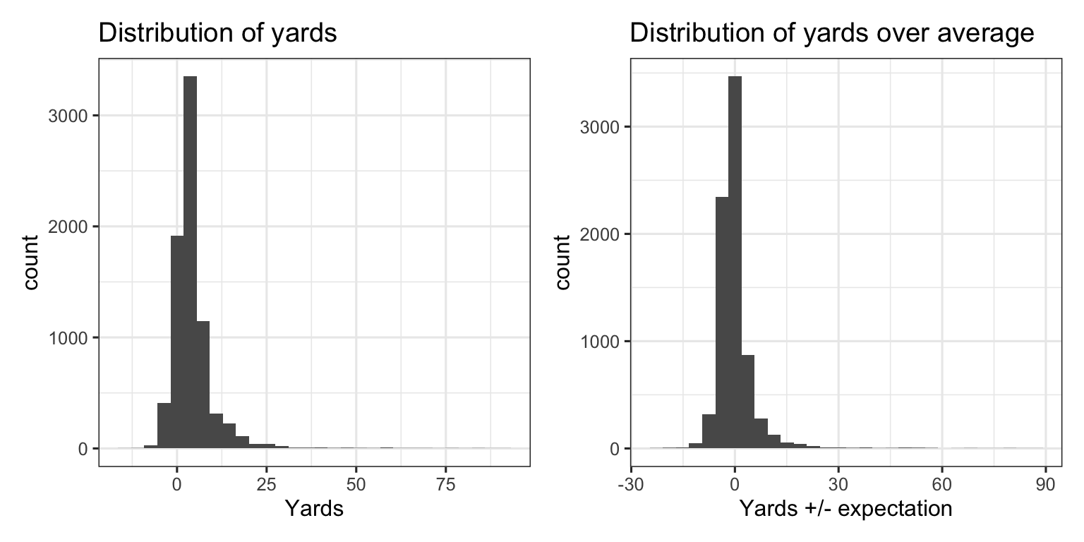
The distribution of yards above expectation is centered at 0 and is slightly more symmetric than the distribution for yards, but there remain outliers and a heavy tail to the right. That is, despite the Zoo’s projections being accurate on aggregate, yards over expectation boasts a fairly similar distribution to yards.
The skewness of each distribution, combined with the relatively small number of carries that are afforded to running backs each season, can make it difficult to infer much about player talent using averages alone. Damien Williams’ 91 yard touchdown run, for example, was only expected to gain 5.2 yards. In the histograms above, there’s not much difference between 91 yards and 85.8 yards above expectation.
Assessing repeatability using yards over expectation
A frequent goal of sports analytics is to find players that are able to consistently able to outperform expectations. This is generally done by splitting samples into two samples (say, odd games and even games, training and test data, or year over year preformances). Steph Curry shooting 3-pointers, Lionel Messi on set pieces, and Mike Trout’s exit velocity are examples of players who will consistently outperform expectations.
Running back metrics have traditionally been shown to be unpredictable, and the skewness of the distributions above is part of the reason why. Here’s a histogram of yards over expectation for Damien Williams’ 82 carries.
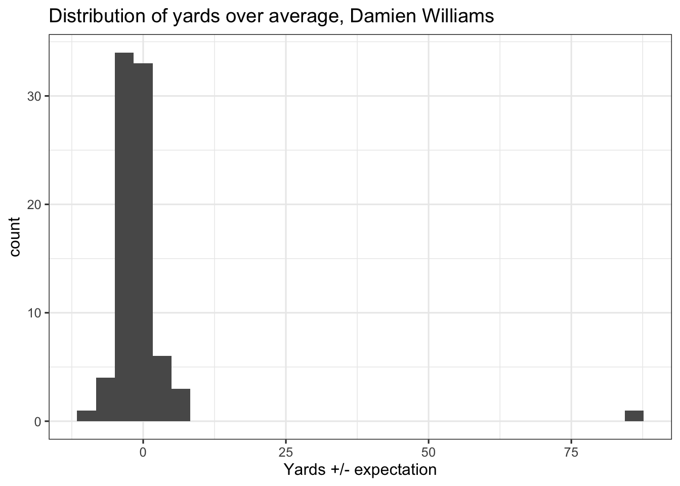
Williams has 81 carries with between -10 and 7 yards +/- expectation, and one carry with +85.8 yards over average. If you split Williams’ carries into two even subsamples, each with half of his carries, the 91 yards (or 85.8 yards above expectation) is only going to end up in one of them. Doesn’t really matter how many times you sample, and you could even sample with replacement. At the end of the day, the inclusion of that one play will determine how consistent (or inconsistent) you view Williams’ season.
More generally, the chart below splits Big Data Bowl predictions into two random data sets (sample’s 1 and 2), and compares each RBs average yards gained above and below expectation between the two samples.
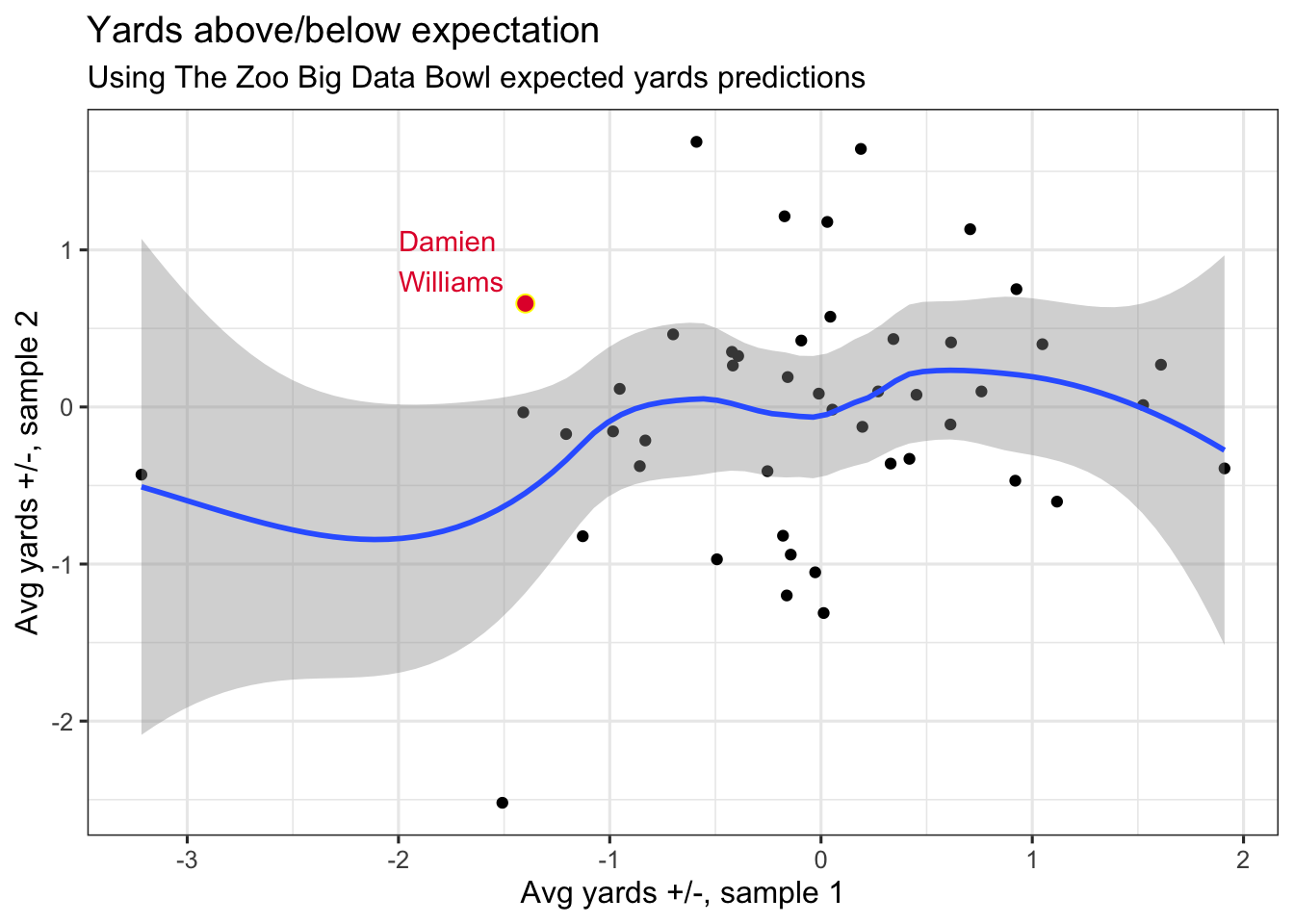
There’s potentially a small link between ball carrier performance in the two samples, but it’s hard to separate from noise (even scatter). Sampling in this fashion 1000 times averages a correlation coefficient of 0.17. By and large, there’s a weak, linear association in yardage above/below expectation when cut between two random splits of data.
If you are curious where Williams is, he’s always in the top left (if his touchdown run was in sample 2) or bottom right (sample 1), depending on chance.
What else is there?
Big Data Bowl predictions aren’t just expected yards – they’re distributions. Here’s the empirical cumulative distribution function (CDF) for two sample carries, a Cordarrelle Patterson two-yard loss and a Raheem Mostert 41-yard touchdown run.
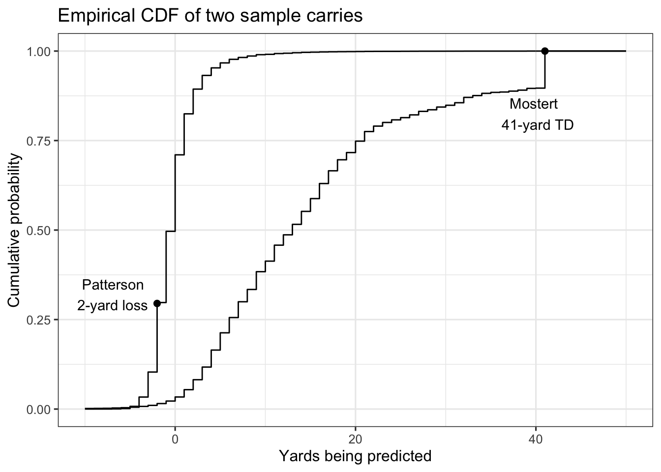
There’s basically nothing about the two plays that’s similar. As an example, Mostert was as likely to reach 12 yards as Patterson was to lose a yard (50%), which is a fairly wide gap in terms of modal performance.
Using expected yards, Mostert overperformed by about 30 yards, while Patterson fell about a yard short. But I’m not sure those numbers tell the best story. There’s basically 0 chance Patterson could’ve finished with 30-yards over expectation on his carry (even though his play started near midfield). If we judge by yardage over expectation, Patterson would need to replicate his play seven times, and on each play gain seven yards (probability ~ 0) to match Mostert’s yards above average.
In place of yardage expectations, there’s a more intuitive way of comparing Patterson’s run to Mostert’s – their CDFs. That is, each point on the y-axis in the chart above maps to yardage gains that are equivalent between the two runs. The following chart shows how Patterson losing two yards was equivalent to a carry where Mostert gained 8 yards. Both gains correspond to roughly 0.30 on the y-axis.
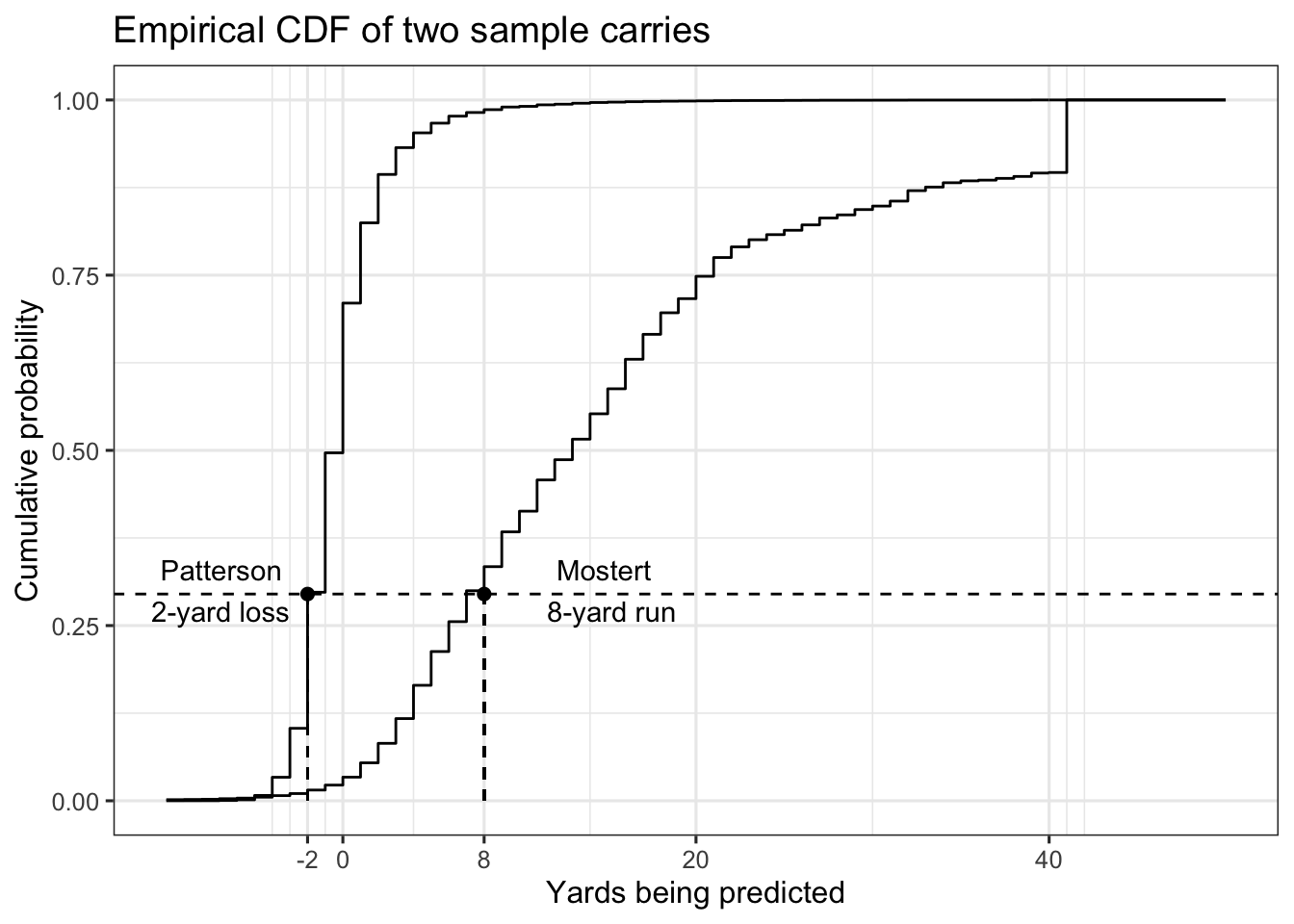
Mostert picking up eight yards is the closest match to Patterson losing two yards. As an alternative comparison, an eight-yard gain for Patterson is roughly as likely as what Mostert did on his touchdown run.
There are a few side benefits of using these CDFs.
First, they’re intuitive – the cdf is a percentile. Patterson losing 2 yards and Mostert (hypothetically) gaining 8 yards both correspond to the 30th percentile. That is, 30% of running backs would be expected to perform at or below those yardage marks.
Second, percentiles will (roughly) follow a uniform distribution, which means fewer, if any, outliers.
What do CDFs from the Big Data Bowl tell us?
Using all plays in the Big Data Bowl, I mapped each observed yardage gained to the corresponding percentile. That percentile roughly corresponds to a play-level performance for a running back, using the distribution of The Zoo’s predictions. Higher is better.
Here are density plots looking at the percentiles for the 28 players with at least 100 carries in the sample. Players are ordered in order from lowest to highest median percentiles.
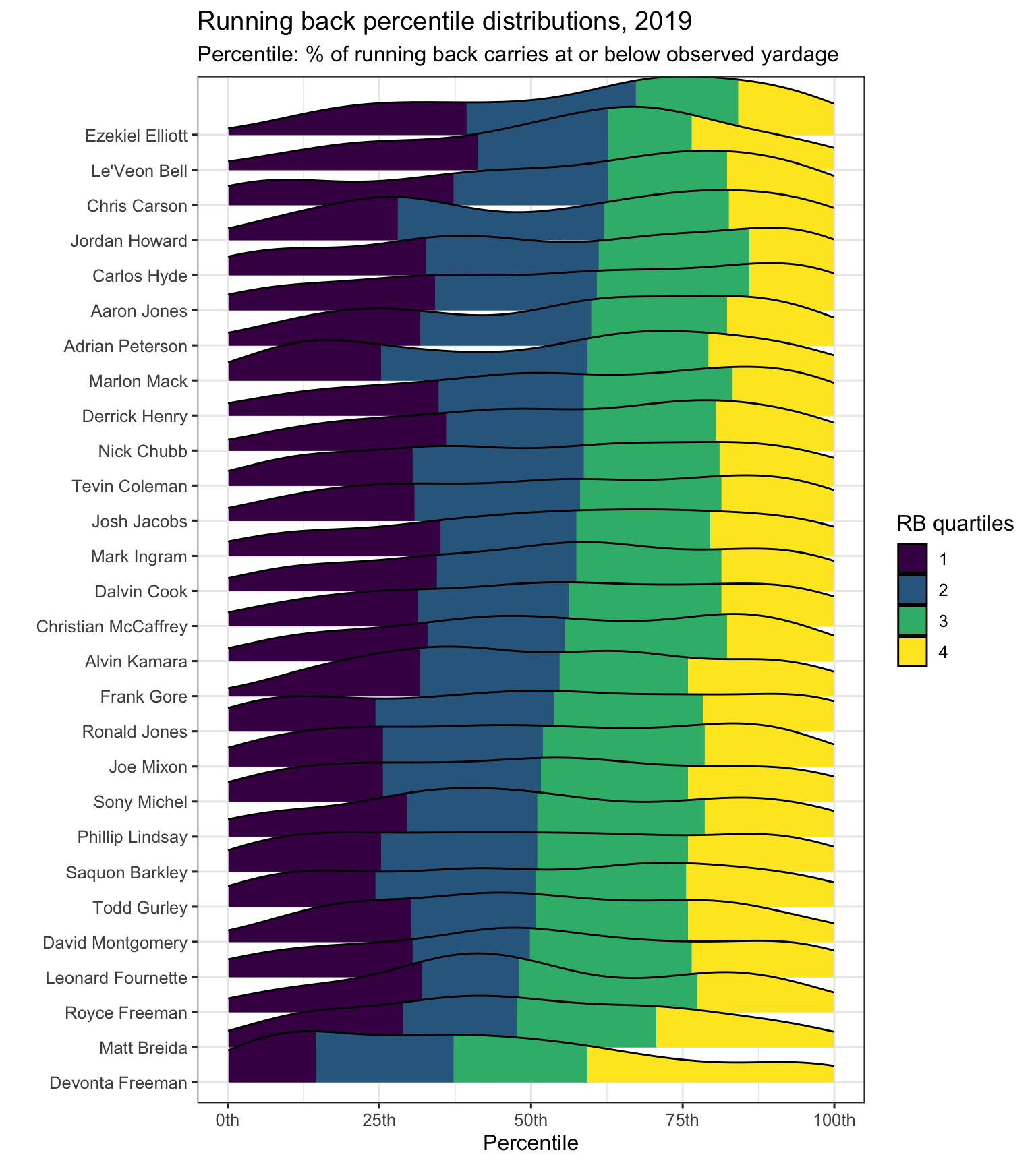
Ezekial Elliott’s typical carry ended in the 67th-percentile of what a typical running back would gain, while Devonta Freeman was in the 37th-percentile. Roughly, it was just as common for Freeman to finish in the top-quarter of running back distributions as it was for Elliott to finish in the top half. Le’Veon Bell, Chris Carson, and Jordan Howard are other names atop the chart.
As a final step, we check to see if there’s any more consistency in running back percentile scores. The chart below splits again splits players into two samples randomly, but this time focuses on the average percentile for each run.
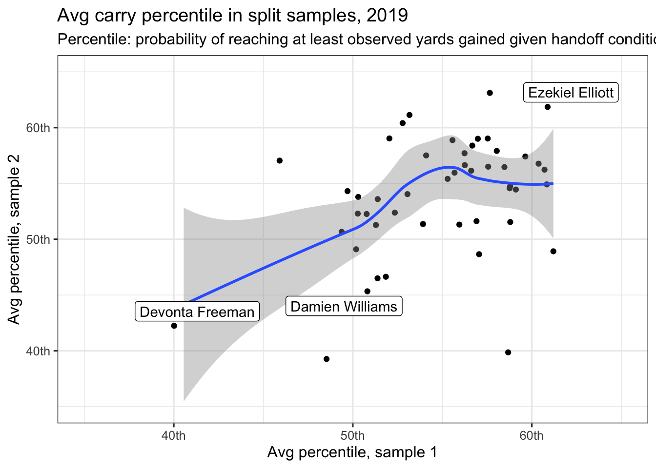
Freeman, Elliott, and Williams are all highlighted, with performances that appear consistent in the two samples. Williams, with his long touchdown run reduced from extreme outlier to simply the 100th-percentile, is no longer as impacted by that one big carry.
The correlation coefficient in the above plot is 0.40 – that matches what occurs if you take a few thousand such random samples.
To repeat: using percentile in place of yards +/-, even when looking at the identical set of plays, allows us to upp our split sample correlation coefficient from 0.17 to 0.40 when looking at running back performance.
What’s it all mean
Not that yardage is ever perfect, but looking at yards and yards over expectation is tricky in football given the influence of outlying observations. This weakness is likely also the case with win probability added and, to a lesser extent, expected points. In place, comparing running back performance by matching the observed yards gained to an entire distribution of yards gained potentially provides deeper insight into running backs that over or underperform the opportunities in front of them. In addition to being able to put carries from much different settings into similar context, the percentiles appear more predictable, on a per-ball carrier basis, from one sample to the next.
As one caveat to this analysis, Big Data Bowl projections include ball carrier speed and acceleration at handoff. If you consider those to be proxies for player skill, then there’s already some player characteristics baked into the projections. In other words, maybe the projections for Mostert’s touchdown run were really high because Mostert was running fast at handoff. If that’s the case (and as referenced by Sam et al here), a model designed for player evaluation would use player average speed/accelerations at handoff.