To err is to human
In the third inning during a contest a few weeks back between the Nationals and Cubs, Washington’s Brian Goodwin hit a line drive to left field with two outs and a runner on third. Despite an initial pause, Chicago’s Kyle Schwarber ran in and attempted to field the ball around his knees.
Ruled an error on Schwarber, the play gave the a Nationals run in an eventual 9-4 win. This struck me as an odd ruling. Schwarber could have easily stood still, retrieved the ball on a hop, and not been given an error. Instead, by trying to field the hard hit ball and missing, he was punished. Note that Goodwin did not reach second after Schwarber’s mishap.
Intracacies of the baseball rulebook are out of my realm of expertise, but that specific play got me thinking about what goes into decisions to reward an error. Primarily – is the difficulty of the play (including the exit velocity of the hit) taken into account? Fielding a sharp ground ball or line drive, no matter where its hit, would seem excessively more difficult than fielding a dribbler or pop fly. Alternatively, one could argue that its the slowest ground balls that are the most problematic, given that a fielder may need to rush his throw.
The point of this post will be to identify a few predictors of error rates, starting with a sidebar about categorizing continuous variables.
Exit velocity is so good .. it predicts higher and lower error rates.
Using the last two seasons of Statcast data, and with a huge hat tip to Bill Petti’s baseballr package, I grabbed all potential putouts (any play ruled an out, error, sac fly, bunt, etc). The Statcast data is super useful, as for games since 2015, it contains exit velocity and launch angle for each ball in play.
My first interest lies in whether or not exit velocity is linked to error chances. One popular strategy (both in and outside of sports analytics) is to categorize data. In other words, group balls in play together, bin hits with similar velocities, and check for the frequency of errors within each bin. That was my first step with the Statcast data. But because I was unsure what categories to use, I tried two different sets: (i) 70 mph or less, 70-85, 85 or more and (ii) 80 or less, 80-95, 95 or more. Each was roughly meant to align with softly hit, medium hit, and sharply hit balls, and each contained several thousand balls in play.
Here’s a chart showing the fraction of plays resulting in an error in each bin. The point in each graph is the average number of errors on all balls in play for each bin.
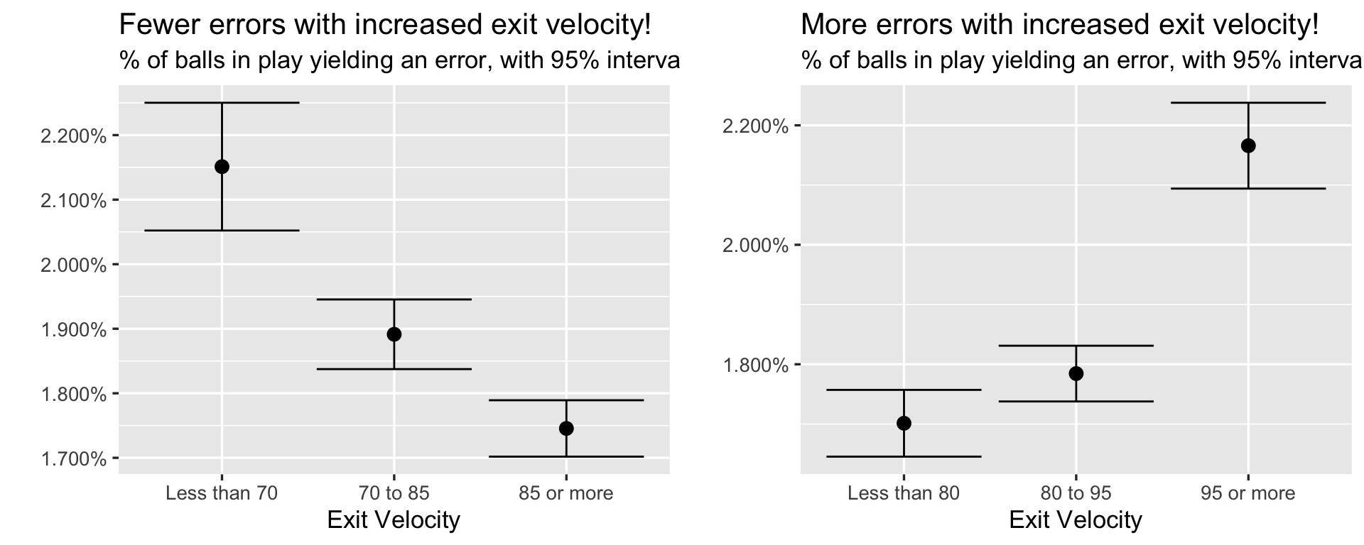
Your eyes are not deceiving you.
On the left graph, there’s a drop in error rate with increased exit velocity – on the right, there’s an increase in the rate of errors. That is, with identical data and only a slight shift in groupings, you could make either claim and feel justified. Errors appear to both increase and decrease with harder hit balls, and both contrasts are statistically significant (those are 95% intervals included with each point).
So which is it?
In fairness to the above analysis, both charts are correct. In unfairness to the above, such analysis is often problematic, and its no accident that the findings conflict.
Specifically, categorizing a continuous variable and looking within each category or bin can lead to a host of statistical problems. For an excellent overview, see a Vanderbilt biostat write-up here, or read a more thorough paper by Caroline Bennette and Andrew Vickers here.
Two problems discussed above specifically come into play with respect to our binning above.
Categorization assumes that there is a discontinuity in response (error rates) as interval boundaries are crossed.
Categorization assumes that the relationship between the predictor (exit velocity) and the response (error rates) is flat within intervals.
Indeed, error rates have a slightly more complicated relationship with exit velocity than can be explained by intervals, and when diving deeper, it’s evident that there’s no natural discontinuity in the rates of errors that we could even try to use.
An alternative strategy for measuring error rates.
Instead of binning, a more appropriate technique would involve modeling the rates of errors given exit velocity.
Of course, in light of the above charts, the link between error rates and exit velocity may be complex, and traditional logistic regression may not be sufficient. Instead, I used a generalized additive model (GAM) that included smoothed terms for both exit velocity and launch angle. GAMs can be great with sports data – they are easy to implement, explicitly include cross-validation as part of the fitting process, and don’t require an exact model specification. Given that we don’t know the best way to specify a model of errors given launch speed, GAMs are a natural fit.
One final plus? GAMs also make for nice visualizations, something that every sports analyst should always be working on. If you want to read more about GAMs, start with the Stitch Fix tutorial, or I’ll shamelessly promote my work on NFL referees (link) and Brian’s work on MLB umpires (link)
Here’s a chart showing the estimated error rate given exit velocity (x axis) and launch angle (y axis). Darker shades are linked to higher error rates.
## Loading required package: nlme##
## Attaching package: 'nlme'## The following object is masked from 'package:dplyr':
##
## collapse## This is mgcv 1.8-24. For overview type 'help("mgcv-package")'.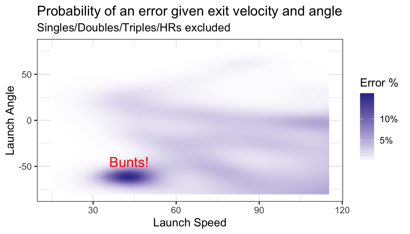
Turns out, there’s an obvious driver of the error rate weirdness – sacrifices!
A few thousand of our plays feature balls hit at roughly 40 mph going (almost) directly into the ground. While not all of these plays are attempted bunts, many appear to be (according to the Statcast play by play descriptions). Turns out, bunts are linked to high error rates (as high as 14%), likely on account of how quickly the pitcher and infielders need to react.
Returning to our original question, there does appear to be a slight increase in error rates with increased exit velocity after discarding bunt attempts. Although balls hit between 50 and 90 mph all yield roughly have the same chances of an error (somewhere around 2%) – error chances increase with the hardest hit balls. With exit velocities of 110 mph or higher, for example, our model expects error rates at several launch angles to be more than 5%.
Note that one downside of the chart is that we don’t get to see how many balls are hit at each launch speed and angle. For example, the dark right corner of the chart only includes a few fieldable plays, and these estimates likely come with substantial error. However, we can crosscheck some of the dark spots using the actual data. Sure enough, balls hit with an exit velocity of 100 mph or higher within +/5 degrees of 0 yield an error rate of 4.9% (there were about 5400 such instances). Hit it 105 mph or harder in that same zone, and the error rate jumps to 6%.
What’s the take home?
From a statistical perspective, hopefully you can recognize both the dangers of categorizing continuous data, as well as the attractive features offered by a GAM (and if you want to try a GAM yourself – the code is up here).
From a baseball perspective, the hardest hit balls do increase error rates. Additionally, with my intuition being that errors are often discarded from the perspective of analyzing hitter talent, this type of error creation could be worth thinking more about. In addition to a side benefit of someone who hits the ball as hard as Aaron Judge or Giancarlo Stanton, having good, capable bunters could actually be undervalued. Putting down a sacrifice is generally not considered worth it (trading an out for moving up a base), but with error rates as high as 14%, there may be more to the story.