When the Jets traded pick No. 6, No. 37, No. 49, and a 2019 pick to the Colts for pick No. 3, I broke out my trusty draft curve to see what it said about the trade.
| Pick Number | Value | Team |
|---|---|---|
| 3 | 52.5 | to the Jets |
| 6 | 50.6 | to the Colts |
| 37 | 33.5 | to the Colts |
| 49 | 28.3 | to the Colts |
Even when you ignore the 2019 pick conveyed to the Colts, the Jets are enormous losers. To be more specific, the Colts aquired 112.4 points worth of draft value in exchange for 52.5 points. Or, perhaps a better way of putting this deal: had the Jets also received back the first pick in the deal, they would’ve just about broken even.
These findings accord with just about every take I saw on the trade that came from analytically-minded sources. Even on Jimmy Johnson’s outdated version of the trade chart, Indianapolis comes out ahead.
But still, something didn’t pass the smell test, and I figured it was worth a go at revisiting my draft curve.
What if a team wants a superstar?
One limitation of the draft curve above is that it focuses on the average player performance. For the Jets, pick. No. 3 is worth an average value of 52.5 points over the course of a career (for those scoring at home, this is reflects a player’s career Approximate Value). But a team may not be drafting for average player performance, and instead, may prefer a shot at a superstar. How can we tweak our draft curve to account for this team preference?
Instead of focusing on a smoothed average at each line, we can instead set a cutoff for what it means to be a superstar, and adjust our valuation of each pick to estimate the likelihood of landing a player above that cutoff. There are several reasons to do this, and I generally dislike setting arbitrary cutoffs. However, there are two benefits of thinking this way. First, the valuations of each pick – the likelihood of landing a superstar – are easy to interpret, which may help in the communication of results. Second, only 11 players are allowed on the field at a given time, and so even if you nail a bunch of 7th round picks, you can’t play them all at once.
There are several ways to identify a super-star. For ease of implementation, I identified the players in the top 21/22 percentile, which is a very rough estimation of whether or not that player could have been identified as the best player on the field at any given time point. Using career AV as an outcome, this corresponds with players with a career AV greater than 66. Here’s a sample of players just above and just below the cutoff.
| Name | Pos | CarAV.projected | Star |
|---|---|---|---|
| Reggie Nelson | DB | 63 | FALSE |
| Thomas Jones | RB | 62 | FALSE |
| Adrian Wilson | DB | 64 | FALSE |
| Brian Westbrook | RB | 69 | TRUE |
| Lawrence Timmons | LB | 72 | TRUE |
| Tra Thomas | T | 69 | TRUE |
Among the players meeting our star criterion listed above, Westbrook, Timmons, and Thomas all made the Pro Bowl at least once in their careers, and each player was also named to at least one all-Pro team, so this seems like a reasonable cutoff to make.
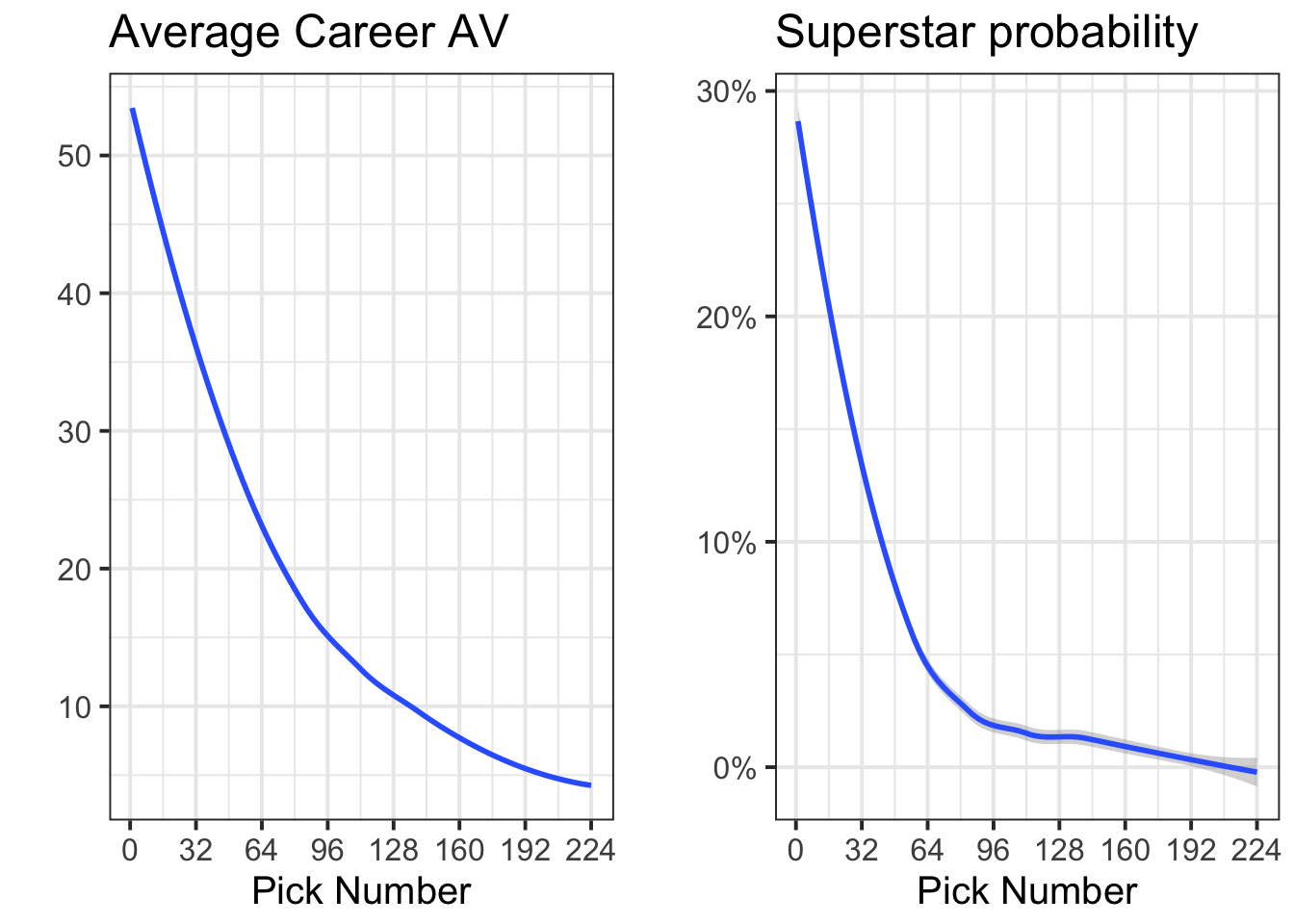
Here’s a side-by-side comparison of the two competing charts. On the left is my original draft curve, and on the right is the superstar-specific one.

There are notable differences between the two curves. Primarily, the superstar curve on the right features a much steeper cutoff than the average curve. The superstar curve also makes it quite clear that by pick 100, it is exceedingly unlikely to land a superstar player.
Revising the Jets trade
Here’s a look at the Jets/Colts trade using the superstar-based curve.
| Pick Number | Value | Team |
|---|---|---|
| 3 | 0.32 | to the Jets |
| 6 | 0.29 | to the Colts |
| 37 | 0.09 | to the Colts |
| 49 | 0.07 | to the Colts |
Although it’s not exactly quite right to simply add these percentages, the Jets’ return of pick No. 3 (32% chance of a star) looks a bit more reasonable. Using the star rates as pick values, the Jets gained 32 points worth of value in exchange for 43 points. That’s the equivalent of losing out on about the 27th pick in the draft (which is much more reasonable than losing out on the 1st pick in the draft).
Building the best curve
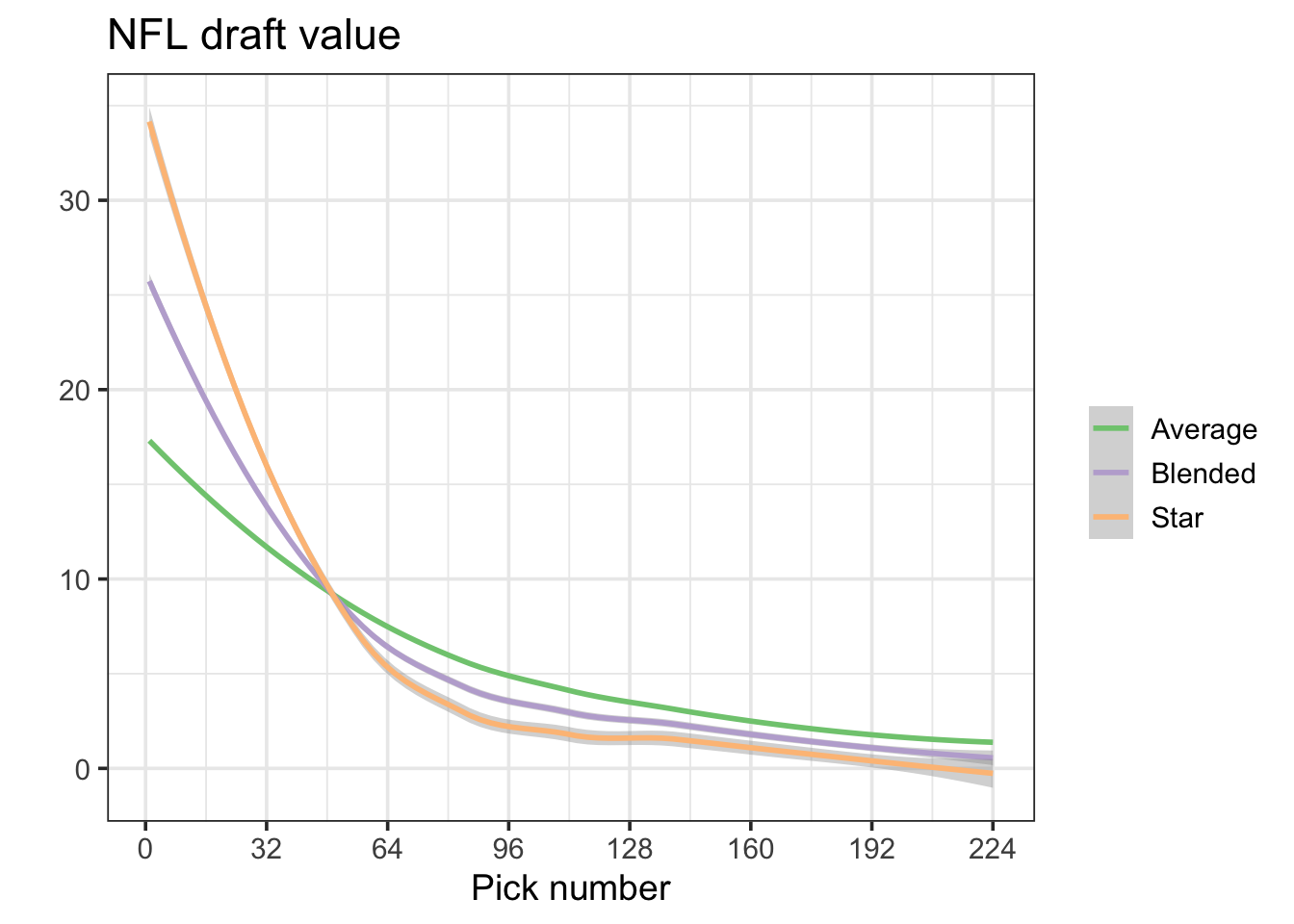
Perhaps a better draft curve incorporates both overall average pick performance and star likelihood. To do that, I scaled the curves above so that they each had the same total draft valuation, took an average, and then re-scaled that average so that the first pick was worth a value of 1.
Here’s that curve. The curve in the middle (shown in purple) reflects the average between the average and superstar curves.

Using the so-called blended draft curve, here’s a final look at the Jets/Colts trade.
| Pick Number | Value | Team |
|---|---|---|
| 3 | 27.8 | to the Jets |
| 6 | 25.4 | to the Colts |
| 37 | 10.8 | to the Colts |
| 49 | 8.7 | to the Colts |
The Colts still made out like bandits – roughly getting about a 60% rate or return on their No. 3 pick – but it doesn’t look as egregious as it initially did. Roughly, the Colts got value worth about the 20th pick in the draft for free by this blended approach.
Final thoughts
A blended draft curve is by no means final, but it’s one approach for considering how teams aren’t just drafting for average value, and that they are often looking for a superstar. I should also note that this isn’t my idea at all – Michael Schuckers wrote about it in JQAS, a paper you can read here. Schuckers uses a blend of outcomes to make a final draft curve, and there’s no reason to suspect that mine is any better than his.
Teams should be doing deeper research into making similar curves for themselves. These should include the salary for each pick, our could use better cutoffs to reflect what they are looking for in players (superstar, consistent starter, etc). But for now, hopefully it makes a bit of sense why an initial, smoothed draft curve may be limited.
If you want to evaluate trades yourself using the blended curve, I uploaded a table here