A few years ago at a statistics conference, Greg, Ben and I sat down to air a few greviences about our favorite sports. They were upset about baseball, and I was irked about hockey. Why the irritation?
Relative to other popular sports like basketball and football, it seemed to us at the time that the best team was winning less often in baseball and hockey. And as fans wanting skilled teams to be rewarded, it was frustrating to so often have well-constructed teams fall short of titles.
And so we decided to write a paper (pre-print here), now forthcoming in Annals of Applied Statistics, that extends Glickman and Stern’s state-space model to make comparisons between the NFL, NHL, NBA and MLB. In this post, I’ll describe the attraction of a state-space model, how to build one yourself (using the 2017-18 NHL season), and use our model estimates to answer a few hockey-specific questions. The entire analysis is reproducible, and you should be able to copy-and-paste your way into replicating the findings below.
The role of betting market data
Team quality in sports is not static. Players get hurt, traded, or decide to retire. Managers are fired. Teams rest players, switch starting goalies, rotate a pitching staff, or decide they want to tank. All of these aspects make measuring team strength a bit dicey.
Moreso than wins and losses or point differential, perhaps the best game-level metric of team strength comes not in what happens during the game, but what’s known before the game begins. Indeed, it’s been shown time and again that there’s no better way to judge models in sports than to compare to betting market data. Prior to each contest, betting markets put out probabilities associated with each team winning. The reason this data is so accurate is that it takes into account all of the factors above – injuries, opponent strength, line-ups, tanking, etc. And so as the saying goes – ``if you can’t beat em, use their data to develop a state-space model.’’ Or something like that.
Assume home team (listed at -130 on the money line) is playing away team (+110). Punters backing believe that squad has better than a chance of winning, while betters on team assume it has at least a probability of winning. Accounting for the vig – which markets use to ensure a long-term profit – team can be assumed to have a chance of beating .
Let’s take a look at what this data could look like. Here’s a sample of the 2017-18 NHL season (thanks to Andy for sharing his spreadsheet, which loads using the gsheet package).
library(tidyverse)
library(rjags)
library(gsheet)
library(lubridate)
library(stringr)
library(knitr)

logit <- function(p) {
  out <- log(p/(1 - p))
  return(out)
}

## Read in data from google sheets
urlA <- "https://docs.google.com/spreadsheets/d/1Hsmqphn9kGqWa88aYnimQxOvdV7ulv_jeIj0SYeBr3s/edit?usp=sharing"
nhl1718 <- gsheet2tbl(urlA)

## Improve the date format
nhl1718 <- nhl1718 %>% separate(date, c("day", "month"), "-") %>%
  mutate(date = ymd(paste(year, month, day)))

min.day <- min(nhl1718$date)
nhl1718 <- nhl1718 %>%
  mutate(day = date - min.day, week = as.numeric(floor(day/7) + 1))

tab.out <- head(nhl1718, 4) %>% select(date, home, away, p_home)
kable(tab.out)| date | home | away | p_home |
|---|---|---|---|
| 2017-10-04 | Winnipeg Jets | Toronto Maple Leafs | 0.5284 |
| 2017-10-04 | Pittsburgh Penguins | St. Louis Blues | 0.6275 |
| 2017-10-04 | Edmonton Oilers | Calgary Flames | 0.5900 |
| 2017-10-04 | San Jose Sharks | Philadelphia Flyers | 0.5810 |
In the first four games of the year, Winnipeg, Pittsburgh, Edmonton, and San Jose were all favorites to some degree, with Pittsburgh the most plausible winner.
Building a state-space model
Let (in our data, this is called p_home) be the log-odds of the observed betting market probability in a game played between and during week . We take the logit transform of each probability, which more closely aligns our outcomes with a normal distribution.
We formally assume that:
where and reflect the corresponding team strengths of and during week , and is the home advantage parameter. You’ll note that as goes up, so to does team ’s probability of winning; followers of paired comparison comparison models will recognize this formulation as identical to Bradley-Terry.
A state-space model assumes that the team strength estimates (, , etc.) evolve over time, with team ’s strength at week a function of both how good it was last week (), as well as some prior noise. This is perfect for sports data – teams generally evolve slowly, and the best predictor of how good any given team is at a given time point is likely closely related to how good it was at the time just prior.
Formally, we assume that for any given team ,
which imposes a first-order auto-regressive process to team strength (denoted by ). Above, corresponds to week-level uncertainty in the evolution of team strength. In the long run, we assume , which prevents team strengths from exploding, and corresponds to the fact that, eventually, the best and worst teams in pro-sports will revert towards the league average.
Here’s how we can built the model above, where we use the rjags package in R to do some Bayesian inference using Gibbs sampling. First, we define our model inputs using outcome , week , and design matrix . For an -game season played between -number of teams, corresponds to an x matrix, where each row contains exactly one 1 (for the home team) and one -1 (for the away team).
y <- logit(nhl1718$p_home)
w <- nhl1718$week

#create a design matrix
Teams <- sort(as.character(unique(c(as.character(nhl1718$home)))))

#Defining the number of things
nTeams <- length(Teams)
nWeeks <- max(nhl1718$week)
n <- nrow(nhl1718)

#Defining the design matrix
x <- matrix(0, nrow = dim(nhl1718)[1], ncol = length(Teams))
for (i in 1:dim(nhl1718)[1]) {
  x[i, which(as.character(nhl1718[i,"home"]) == Teams)] <- (1)
  x[i, which(as.character(nhl1718[i,"away"]) == Teams)] <- (-1)
}
As an example, row 1, a game between home team Winnipeg (the 31st NHL team, alphabetically) and away team Toronto (27th), has a 1 in the 31st column and a -1 in the 27th column, with the rest of the entries equal to zero.
Next, our Bayesian approach requires prior distributions on the parameters of interest. I’m happy to answer specific questions if you’d like, but the BUGS code below corresponds to the models above, along with some additional variance parameters that use vague priors. The rjags package is a bit outdated, but here’s one resource where you can learn more.
Here’s what the BUGS code looks like:
model.string <-"
  model {
for (i in 1:n) {
  y[i] ~ dnorm(mu[i], tauGame)
  mu[i] <- alpha + inprod(theta[w[i],],x[i,])
}
for (j in 1:nTeams){
  theta[1,j] ~ dnorm(0, tauSeason)
}
for (www in 2:nWeeks) {
  for (j in 1:nTeams) {
    theta[www,j] ~ dnorm(gammaWeek*theta[www-1,j], tauWeek)
  }
}
alpha ~ dnorm(0,0.0001)
tauGame ~ dunif(0,1000) #uncertainty in outcome for each game
tauWeek ~ dunif(0,1000)
tauSeason ~ dunif(0,1000) #variance parameter for the first week of the season
gammaWeek ~ dunif(0,1.5)
}
"
model.spec<-textConnection(model.string)
Now we’re ready to fit the model. In this example, I used 3 chains, 1000 posterior draws, and a thin of 5, which yields 3 sets of 200 draws for each parameter. The model converges quickly, otherwise we’d want to increase the number of draws at each step.
library(rjags)
n.chains <- 3
n.adapt <- n.update <- n.draws <- 1000

posteriorDraws = c('alpha','theta')
thin <- 5
jags <- jags.model(model.spec,
                   data = list('y' = y,'x' = x, 'w' = w, 'n' = n,'nTeams' = nTeams,'nWeeks' = nWeeks),
n.chains = n.chains, n.adapt = n.adapt)## Compiling model graph
## Resolving undeclared variables
## Allocating nodes
## Graph information:
## Observed stochastic nodes: 1271
## Unobserved stochastic nodes: 842
## Total graph size: 47475
##
## Initializing modelupdate(jags, n.update)
z <- jags.samples(jags, posteriorDraws, n.draws, thin = thin)Examining model output
Our output file z contains information related to each of the parameters we were interested in. In this case, we have z$alpha (home advantage) and z$theta (team strengths), which have dimensions shown below.
dim(z$alpha)## iteration chain
## 1 200 3dim(z$theta)## iteration chain
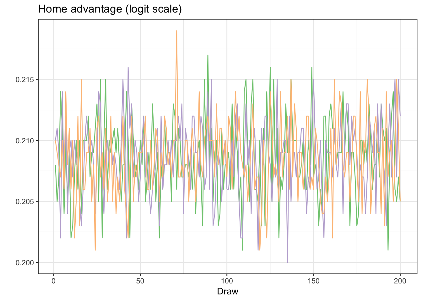
## 27 31 200 3It’s generally a good idea to start a Bayesian analysis by assessing convergence – we do this extensively in our paper – but here’s one trace plot of alpha, which shows that it’s generally well-behaved. Note the y-axis scale – given that our model uses log-odds as an outcome, each of our coefficients are likewise on a log-odds scale. Each color reflects one of the three chains from our Gibbs sampler.
colours <- c("#7fc97f", "#beaed4", "#fdc086")
hfas <- data.frame(round(z$alpha[,,], 3))  %>% mutate(draw = 1:n())
hfas %>% ggplot(aes(draw, X1)) +
  geom_line(colour = colours[1]) +
  geom_line(data = hfas, aes(draw, X2), colour = colours[2]) +
  geom_line(data = hfas, aes(draw, X3), colour = colours[3]) +
  xlab("Draw") +
  ggtitle("Home advantage (logit scale)") +
  ylab("") +
  theme_bw()
The posterior distrbution of is centered at about 0.208. This suggests that home teams, when playing a similarly talented opponent, have about a chance of winning. For those scoring at home, the NHL has the third best home advantage among the four sports we analyzed.
Next, we examine team strengths.
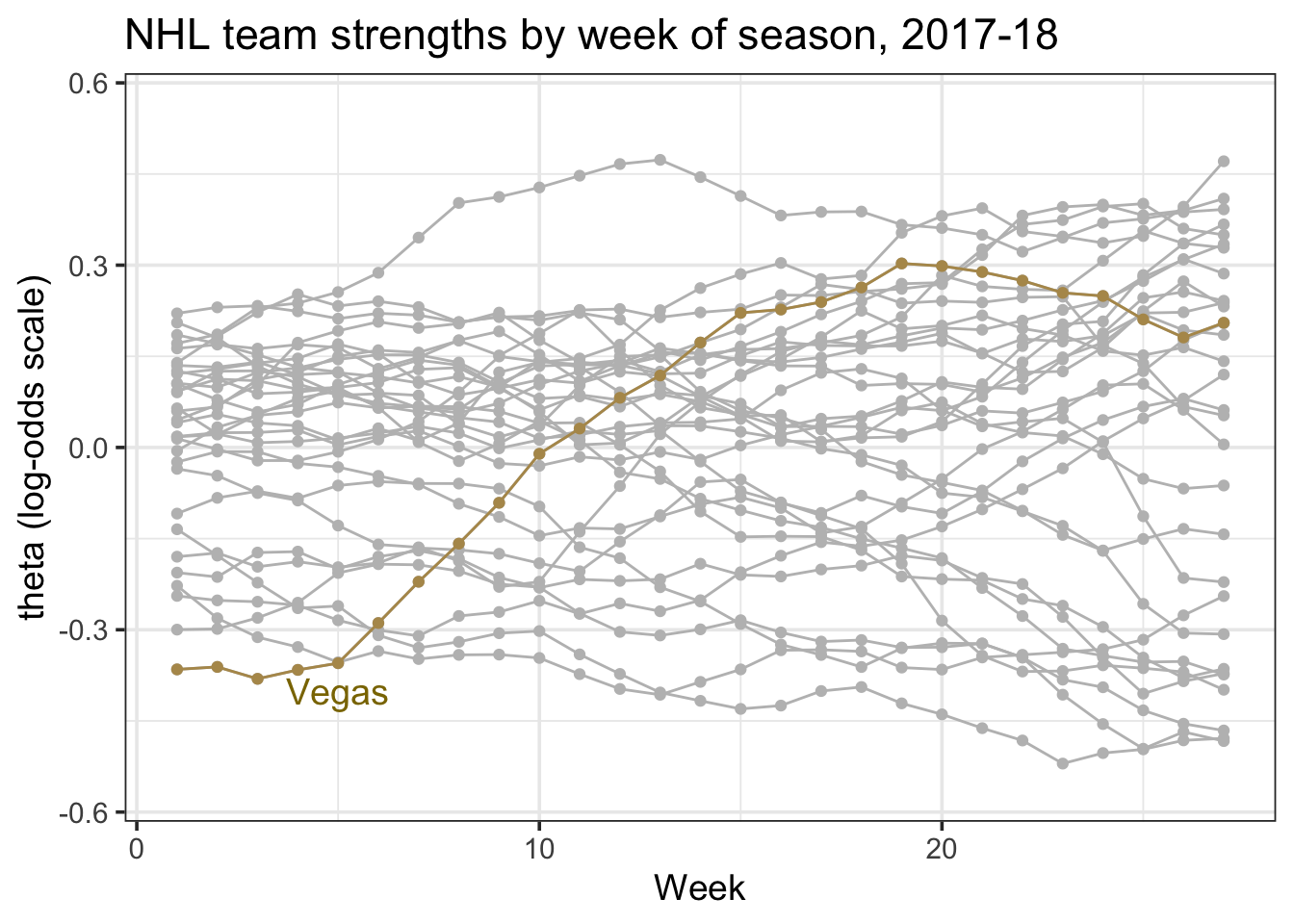
In the code below, I averaged each team strength over each week of the NHL season, and highlight the Vegas Golden Knights, a team that rose from the bottom of the league towards the top.
As with the home advantage parameter, the y-axis reflects a log-odds scale. In this case, a coefficient of 0.5 reflects that a team has an chance of beating a league average team at a neutral site.
avgs <- apply(z$theta, c(1,2), mean)
dims <- dim(avgs)
names(dims) <- c("nweeks", "nteams")
df.beta <- data.frame(
    theta = as.vector(avgs),
    week = rep(1:dims["nweeks"]),
    team_id = rep(Teams, each =dims["nweeks"]) )
vegas <- filter(df.beta, team_id == "Vegas Golden Knights")

ggplot(df.beta, aes(week, theta, group = team_id)) +
  geom_point(colour = "grey") +
  geom_line(colour = "grey") +
  geom_line(data = vegas, colour = "#b4975a") +
  geom_point(data = vegas, colour = "#b4975a") +
  ggtitle("NHL team strengths by week of season, 2017-18") +
  ylab("theta (log-odds scale)") +
  ylim(c(-0.56, 0.56)) +
  annotate("text",x = 5, y = -0.4, label = "Vegas", colour = "gold4", size = 5) +
  xlab("Week") + theme_bw(14)
Vegas had a pretty incredible season.
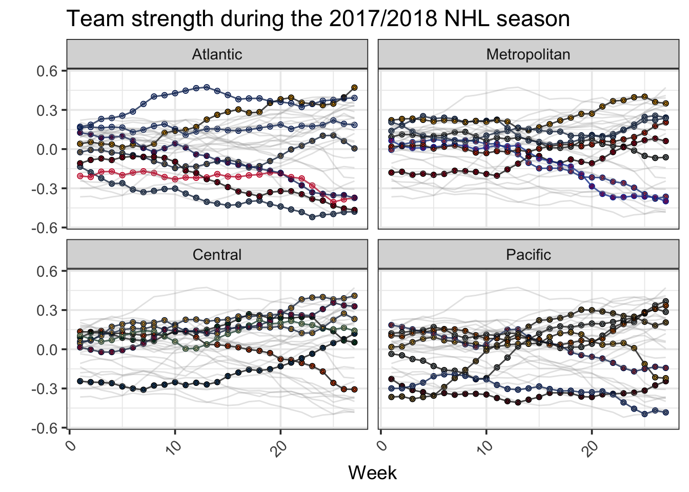
Of course, it’d be nice to see every team. Next, we use the teamcolors package (link) and a bit of ggplot2 wizardry to facet each NHL division in order to observe each team.
library(teamcolors)
teamcolors1 <- teamcolors %>% filter(league == "nhl") %>% rename(team_id = name) %>%
  mutate(rand.color = ifelse(primary == "#010101", secondary, primary))

df.beta1 <- df.beta %>% left_join(teamcolors1, by = c("team_id" = "team_id"))

df.overall <- ggplot(data = df.beta1,
       aes(x = week, y = theta,
           color = team_id, fill = team_id)) +
  geom_line(alpha = 0.5) +
  geom_point(shape = 21) +
  ylim(c(-0.56, 0.56)) +
  scale_color_manual(name = NULL, values = teamcolors1$primary) +
  scale_fill_manual(name = NULL, values = teamcolors1$secondary) +
  guides(color = FALSE, fill = FALSE) +
  theme_bw(base_size = 14)

df.overall +
  geom_line(data = select(df.beta1, -division), color = "darkgray", alpha = 0.3) +
  geom_line(alpha = 0.5) +
  geom_point(shape = 21, size = 0.5, alpha = 0.8) +
  facet_wrap(~division, ncol = 2, dir = "v") +
  theme(axis.text.x = element_text(angle = 45, hjust = 1)) + ylab("") + xlab("Week") +
  ggtitle("Team strength during the 2017/2018 NHL season")
My favorite part about this graph is the distinction between the two Divisions in the Eastern Conference. In the Atlantic Division, Boston, Tampa, and Toronto are three top teams, and apart from the Panthers, the other teams are bottom-dwellers. Meanwhile, nearly every Metropolitan team fits somewhere between the top and bottom of the Atlantic.
Also impressive – check out Colorado’s slow improvement in the Central. The Avalanche started the year as the league’s third worst team (perception-wise), and are now in the playoffs.
Comparisons among teams
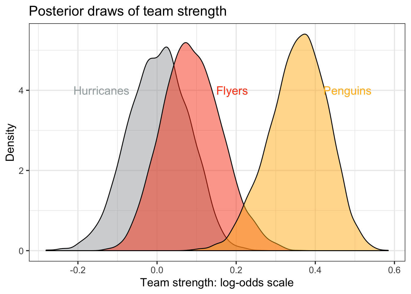
One benefit of using a Bayesian approach is that we can more precisely interpret team strength parameters. As an example, let’s look at the posterior distributions of team strength of three NHL teams, the Penguins, Flyers, and Hurricanes. For this task, I focus on the last six weeks of the NHL regular season, to roughly reflect team strength at season’s end.
teams <- c("Carolina Hurricanes", "Pittsburgh Penguins", "Philadelphia Flyers")
thetas <- z$theta[20:26, Teams %in% teams, ,]
colors <- teamcolors1$secondary[Teams %in% teams]
team.1 <- data.frame(team_id = teams[1], beta = c(thetas[,1,,]))
team.2 <- data.frame(team_id = teams[2], beta = c(thetas[,2,,]))
team.3 <- data.frame(team_id = teams[3], beta = c(thetas[,3,,]))

df.matchup <- rbind(team.1, team.2, team.3)
lmin <- quantile(df.matchup$beta, 0.01)
umin <- quantile(df.matchup$beta, 0.99)

df.matchup %>% ggplot(aes(beta, fill = team_id, group = team_id)) +
  geom_density(alpha = 0.5) +
  scale_fill_manual(name = NULL, values = colors) +
  annotate("text", x = lmin, y = 4, label = "Hurricanes",colour = colors[1], size = 5) +
  annotate("text", x = .19, y = 4, label = "Flyers", colour = colors[2], size = 5) +
  annotate("text", x = umin, y = 4, label = "Penguins", colour = colors[3], size = 5) +
  ggtitle("Posterior draws of team strength") +
  xlab("Team strength: log-odds scale") + ylab("Density") +
guides(color = FALSE, fill = FALSE) + theme_bw(14) 
Above, the Penguins stand out as the best of the three teams. However, although it’s clear the Penguins are better than both the Flyers and the Hurricanes – note the lack of overlap in the density plots – it’s not as clear that the Flyers are better than the Hurricanes.
Using samples from the posterior distribution, we can be a bit more precise: there’s only about a 1 in 2000 chance that the Hurricanes are better than the Penguins, a 1 in 150 chance that the Flyers are better than the Penguins, and a 1 in 5 chance that the Hurricanes are better than the Flyers.
But here’s where the NHL is tricky (e.g, random).
Knowing that the Penguins are better than the Flyers with probability 99.4 percent does not precisely correspond to their chances of actually beating the Flyers when the two teams square off in the 1st round of the 2018 NHL playoffs. In fact, we can use our team strength estimates to sample what a 7-game playoff series could look like, and check how often each team wins. Below, I assume that the Penguins have the home advantage.
set.seed(0)
flyers.strength <- sample(team.2$beta, 7)
penguins.strength <- sample(team.3$beta, 7)
home.advantage <- sample(z$alpha, 7)
logit.games <- penguins.strength - flyers.strength +
  home.advantage*c(1, 1, -1, -1, 1, -1, 1)
prob.games <- exp(logit.games)/(1 + exp(logit.games))
penguin.wins <- rbinom(7, 1, prob = prob.games)
do.penguins.win <- sum(penguin.wins) >= 4
do.penguins.win## [1] TRUEIn the example above, the Penguins emerge victorious – congrats Sam!! – but that doesn’t happen every iteration. Here’s what 10,000 series outcomes would look like:
set.seed(0)
penguins.sim.wins <- 0
for (i in 1:10000){
  flyers.strength <- sample(team.2$beta, 7)
  penguins.strength <- sample(team.3$beta, 7)
  home.advantage <- sample(z$alpha, 7)
  logit.games <- penguins.strength - flyers.strength + home.advantage*c(1, 1, -1, -1, 1, -1, 1)
  prob.games <- exp(logit.games)/(1 + exp(logit.games))
  penguin.wins <- rbinom(7, 1, prob = prob.games)
  do.penguins.win <- sum(penguin.wins) >= 4
  penguins.sim.wins <- penguins.sim.wins + do.penguins.win
}
sum(penguins.sim.wins)/10000## [1] 0.6632Our numbers suggest that the Penguins would beat the Flyers roughly 2 out of every 3 times they played a 7-game series. Unsurprisingly, this almost exactly matches the probability implied in sportsbook series odds, which currently price the Penguins at -225 and the Flyers at +195.
One last thought: how much is the home advantage worth for Pittsburgh? Tweaking the code above, the Flyers would win about 4% more often if they were the team with an extra home game. In other words, only roughly 1 in 25 series outcomes would change were the Penguins to lose their home advantage to the Flyers. This does not appear to be the answer that my Twitter followers expected, as 1 in 25 was the least likely of four outcomes (10, 15, 20, 25).
Summary
The above code implements a Bayesian state-space model to etimate team strength in the NHL season using betting market numbers. Though the rjags package is not the most user-friendly for first-time practitioners, it provides a mechanism for fitting complex models using R. The resulting team strengths are fun to graph and expore, and I encourage you to try it out yourself.
In future work, there are a few questions that I hope to tackle: Can our model detect if certain teams have better home advantages than others? Was there a so-called Vegas flu? And when did betting markets begin to pick up on it? What is the probability that any given team is better than any given other team? How did the NHLs shifting postseason structure (to a divisional format) impact postseason chances?