Brian, Alex, and a host of others have done nice work recently when it comes to creating better scatter plots using images in ggplot in R. In this post, I’ll show how easy it is to use the ggimage package and do the same.
What data to use?
Ron, Sam, Max, and the folks at nflscrapR have built a pretty amazing tool to analyze football play-by-play data. They’ve nicely stored csv’s that summarize several play-level and team-level characteristics relating to each play. In my example, I’ll use this data to contrast team run and pass performance, as measured through expected points added. For more on expected points, see Trey’s series here, or the nfl WAR paper here.
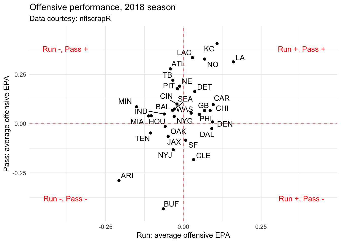
First, we read in the data, and create what would be a typical plot that highlights run and pass performance for each offense.
library(RCurl)
library(tidyverse)
library(ggrepel)
url.18 <- getURL("https://raw.githubusercontent.com/ryurko/nflscrapR-data/master/play_by_play_data/regular_season/reg_pbp_2018.csv")
pbp <- read.csv(text = url.18)
scrimmage.plays <- pbp %>% filter(play_type == "pass"|play_type == "run")
scrimmage.plays.summary <- scrimmage.plays %>%
  group_by(posteam, play_type) %>%
  summarise(ave.epa = mean(epa, na.rm = TRUE)) %>%
  spread(play_type, ave.epa)

bound.label <- 0.38
df.text <- data.frame(lab.text = c("Run +, Pass -", "Run +, Pass +", "Run -, Pass +", "Run -, Pass -"),
                      x = c(bound.label, bound.label, -1*bound.label, -1*bound.label),
                      y = c(-1*bound.label, bound.label, bound.label, -1*bound.label))

ggplot(scrimmage.plays.summary, aes(run, pass, label = posteam)) +
  geom_point() +
  geom_text_repel() +
  xlab("Run: average offensive EPA") +
  ylab("Pass: average offensive EPA") +
  theme_minimal() +
  labs(title = "Offensive performance, 2018 season", subtitle = "Data courtesy: nflscrapR") +
  geom_hline(aes(yintercept = 0), lty = 2, col = "red", alpha = 0.5)+
  geom_vline(aes(xintercept = 0), lty = 2, col = "red", alpha = 0.5) +
  xlim(c(-0.45, 0.45)) + ylim(c(-0.45, 0.45)) +
  geom_text(data = df.text, aes(x, y, label = lab.text), colour = "red")
There’s a bunch that can be gleamed from the chart above. As one example, the team-to-team variability in average pass EPA is greater than that of the team-to-team variability in average rush EPA. As another, 23 of 32 teams boast a greater-than-0 average pass EPA, compared to 14 of 32 teams that have an average rush EPA greater than 0. This doesn’t exactly mean teams should pass more – averages are impacted by skewness, and the distribution of play-level EPA on passes is strongly skewed right.
None of these findings are particularly new, however, and to date, there is a large amount of literature regarding the run versus pass debate. In fact, there’s someone who has probably already made the exact graph above.
Adding in team logos
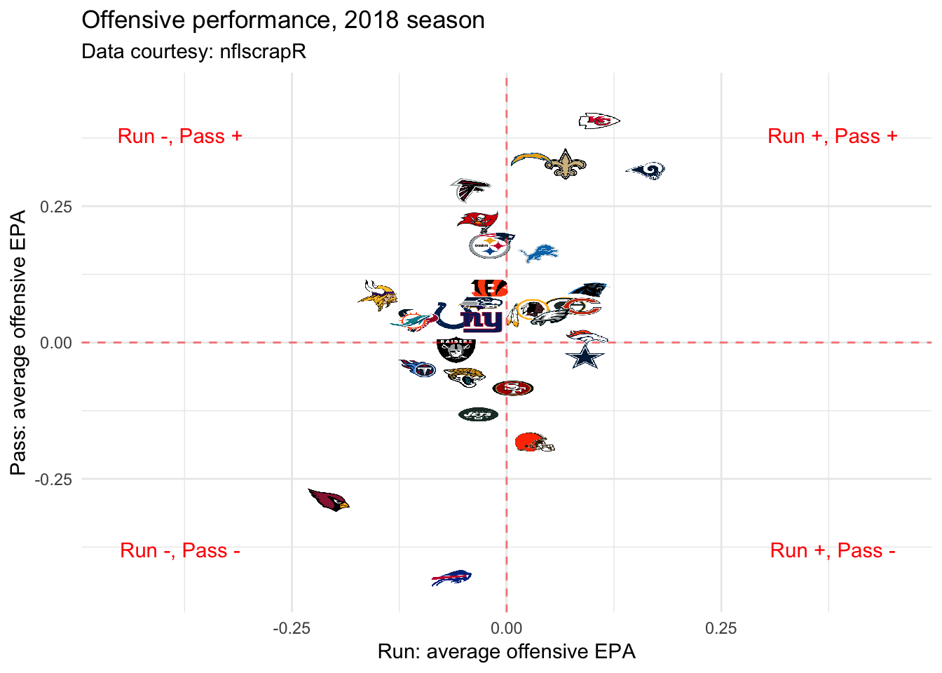
It’s perhaps more visually appealing to use team logos (or helmets) in place of three letter team codes. For ages, adding images to ggplot R graphs required the use of several lines of code: using the ggimage package, that process is (fortunately) no longer needed.
In the code below, I link to a file (eventually stored as df.logos) that has up-to-date NFL logos (drawn via Wikipedia png’s), and merge with the data above.
library(ggimage)
url.logo <- getURL("https://raw.githubusercontent.com/statsbylopez/BlogPosts/master/nfl_teamlogos.csv")
df.logos <- read.csv(text = url.logo)
scrimmage.plays.summary <- scrimmage.plays.summary %>%
  left_join(df.logos, by = c("posteam" = "team_code"))

ggplot(scrimmage.plays.summary, aes(run, pass)) +
  geom_image(aes(image = url), size = 0.05) +
  xlab("Run: average offensive EPA") +
  ylab("Pass: average offensive EPA") +
  theme_minimal() +
  labs(title = "Offensive performance, 2018 season", subtitle = "Data courtesy: nflscrapR") +
  geom_hline(aes(yintercept = 0), lty = 2, col = "red", alpha = 0.5)+
  geom_vline(aes(xintercept = 0), lty = 2, col = "red", alpha = 0.5) +
  xlim(c(-0.45, 0.45)) + ylim(c(-0.45, 0.45)) +
  geom_text(data = df.text, aes(x, y, label = lab.text), colour = "red")
Same chart as we initially had, and one-less line of code. The key command is geom_image, which functions similar to geom_point but requires a url to draw an image from.
Feel free to use the logo file in similar fashion – and I hope you do! Graphs with logos often look better than their text counterparts. One next step will be to jitter team-logos to prevent overlap, but that’s for another day.