Air yards plots are popular and informative ways for assessing the accuracy of quarterbacks at different depths of the field. As examples, Josh and Ben have both done excellent work in highlighting how using where a quarterback was throwing to tells us more of a story than simply looking at completion percentage alone.
Here’s one example of an air yards plot, using a pair of players from the 2019 season.
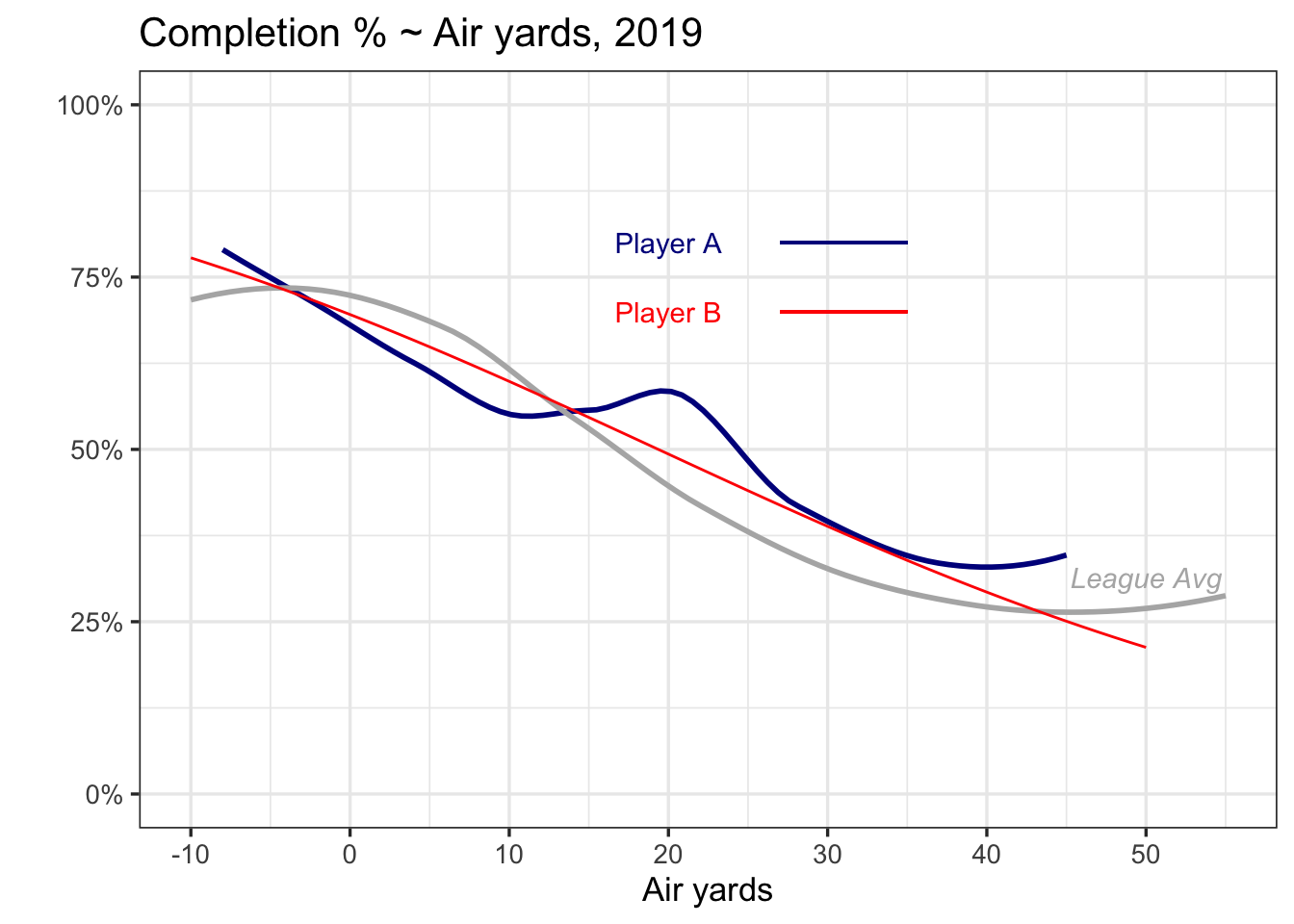
The blue player tends to be slightly worse than the red player at short throws, better than than the red player at distances around 20 yards, and similar for longer distances. Both players are slightly worse than the league average for shorter throws, but better than the league average at longer throws.
Can you guess who Players A and B are?
Player A is Tom Brady in 2019.
Player B is Tom Brady in 2019.
How is that possible? Let’s dive a bit deeper into plots similar to these.
Air yards ~ integer distance
One common approach for assessing the link between completion rate and air yards is to average completion percentage at each air yards integer. Then, with averages at each distance, we can plot those averages, and smooth out rough edges using a trend line.
Here’s the example with Brady above.
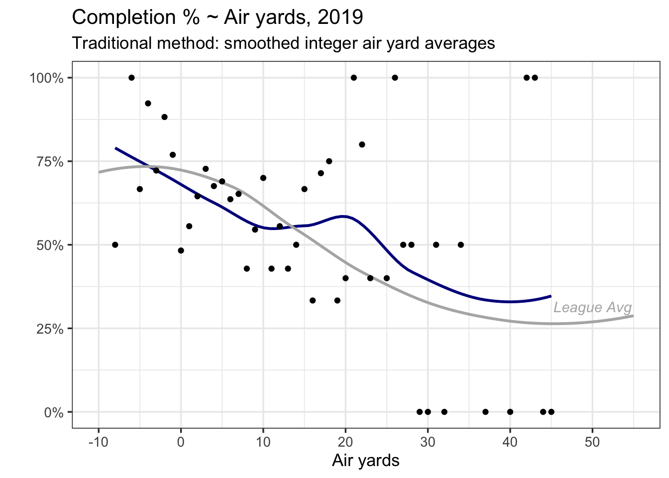
Each of the dots in blue represent Brady’s completion rate at each of the yardage distances he has thrown to in 2019. You’ll notice higher variability in the dots after 30 yards – he doesn’t often throw that far, so averages at 0 or 1 will be more common.
This traditional approach is usually sufficient at highlighting how quarterbacks perform.
However, there are a few limitations.
The trend line corresponds to each dot. But each dot represents a different number of passes, something that the trend line doesn’t know.
Standard errors (if shown) reflect uncertainty in the trend line between the dots, not in the uncertainty in a quarterback’s completion percentage at a certain air yards.
Making improvements
There are several approaches that can leverage the number of passes at each air yards integer. I’ll use a generalized additive model (GAM), where a completion (Yes/No) is my outcome and air-yards is my explanatory variable. GAMs are attractive to measure the effect of any \(x\)-variable that might be related to \(y\) in a non-linear fashion, as they allow for a more flexible association. Additionally, GAMs include cross-validation by default to help prevent overfitting.
Here’s what a GAM would look like for Brady (with calculations for uncertainty also shown).
library(mgcv)
### ay_all contains nflscrapr data from the 2017-19 seasons
ay_brady <- ay_all %>%
  filter(season == 2019, passer_player_name == "T.Brady")

model_player_gam <- bam(complete_pass ~ s(air_yards), data = ay_brady,
                    method = "fREML", discrete = TRUE, family = binomial(link='logit'))
fit_predict <- expand.grid(air_yards = -10:50)
fit_predict$comp_logit = predict(model_player_gam, fit_predict)
fit_predict$comp_error = predict(model_player_gam, fit_predict, se = TRUE)$se.fit
fit_predict <- fit_predict %>%
  mutate(comp_hat = exp(comp_logit)/(1+exp(comp_logit)),
         comp_low = exp(comp_logit - 1.96*comp_error)/(1+exp(comp_logit - 1.96*comp_error)),
         comp_high = exp(comp_logit + 1.96*comp_error)/(1+exp(comp_logit + 1.96*comp_error)))

fit_predict %>%
  ggplot(aes(air_yards, comp_hat)) +
  geom_line(colour = "red") +
  geom_ribbon(aes(ymin = comp_low, ymax = comp_high), fill = "red", alpha = 0.3) +
  geom_smooth(data = ove_ave,
              aes(air_yards, y = ave_rate), colour = "grey70", se = FALSE) +
  labs(title = "Completion % ~ Air yards, 2019", y = "", x = "Air yards",
       subtitle = "Alternative method: model estimates (GAM)") +
  annotate(x = 50, y = 0.31, "text", label = expression(italic("League Avg")), colour = "grey70") +
  theme_bw(13) +
  scale_y_continuous(labels = scales::percent)+
  scale_x_continuous(breaks = c(-10, 0, 10, 20, 30, 40, 50)) +
  coord_cartesian(ylim = c(0,1))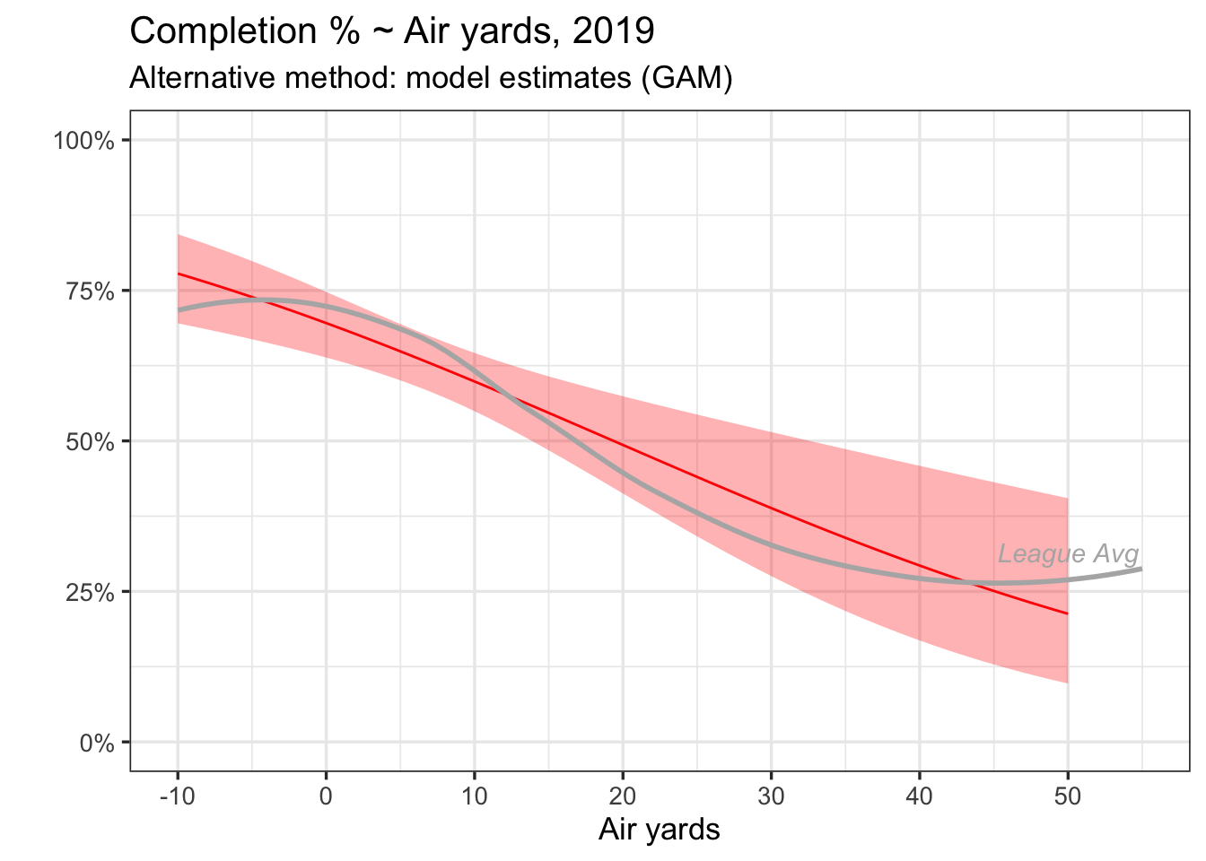
When comparing the two versions, it’s less that one approach is better than the other, but more about what each plot is actually showing. My intuition is what we ultimately want out of each QBs trend line is an estimated completion percentage, and what we ultimately want out of error bars are an uncertainty around that estimate, which is why a model-based approach could be more attractive.
Alternative models (logistic regressions with/without spline terms, hierarchical models, etc) could certainly work here as well.
Extrapolating
Brady is just one example, so I made a plot with all passers in 2019 who have made at least 300 attempts.
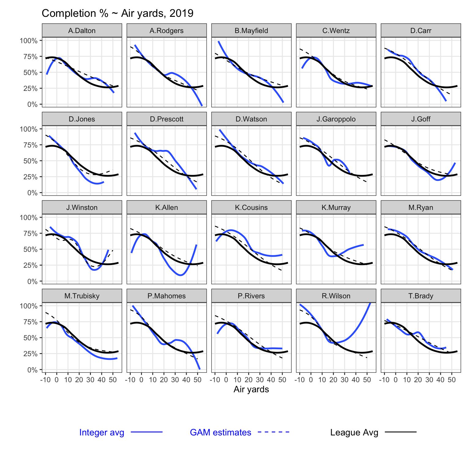
The dark blue-line corresponds to the traditional approach (averages by integer), while the dotted line represents estimates from a GAM (separate for each QB).
As one graph to highlight, note the tail on Carson Wentz at low air-yards. Turns out, Wentz attempted 1 pass at -8 air yards, which fell incomplete, and no other passes at -7 air yards or less. Alternatively, he has 10 completions at 13 attempts between -6 and -5 air yards. A model-based approach is less likely to be sensitive to that one incompletion at -8 air yards.
For fun
Last Sunday night, Drew Brees entered the record books by completing 29 of his 30 passes. Among any quarterback with at least 20 attempts in one game, no player has posted a single-game completion percentage higher than Brees.
It got me thinking about one thing that assuredly did not hurt Brees reach that mark – the game took place in the Mercedes-Benz Superdome.
So, using a separate function for games played in the eight NFL stadia with domes, and one for games that are not played in domes, here’s how the air-yards curves compare. This uses data from 2017 through 2019.
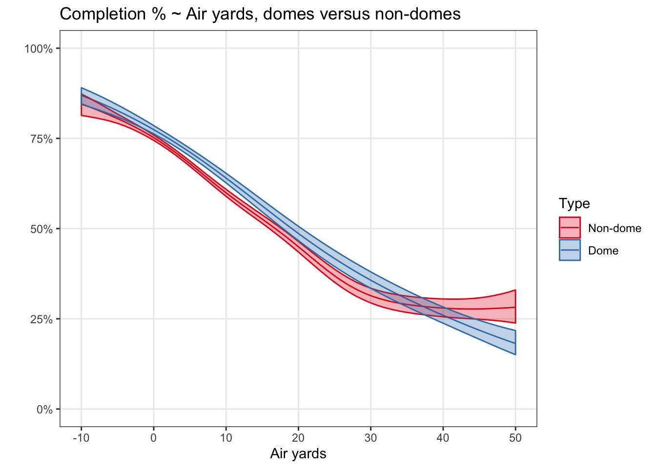
For what it’s worth, the QB closest to the non-dome line was Cam Newton, and the QB closest to the dome line was Dak Prescott (as assessed visually). It’s a fairly consistent difference of roughly 4 percentage points. A deeper look at domes would more appropriately account for the differences in QB abilities between dome and non-dome teams. Alternatively, a model showing only quarterbacks on away teams yielded similar results to the above. Either way, it is plausible that conditions played a small role in allowing Brees to reach such great heights.